Fern + Spruce
Overview
Branding and art direction for a startup vacation rental decor company needing everything from a name to a thoughtful conference leave-behind. We partnered with entrepreneur Sharon Power to bring this brand to life and establish Sharon as an authority on rental style and decor.
Created in collaboration with Courtney Whitehouse, Callie Gabbert, and Randy Gaytan.
Awards:
Austin Ad Fed, Integrated Brand Campaign | Silver Addy
Graphis New Talent, Logo Design | Silver
Graphis New Talent, Integrated Brand Campaign | Merit
Brand Story
In 2017, Sharon Power decided to leave the world of technology marketing and enter the ever-growing vacation rental industry. With her love of strategy in tow, Sharon began Fern + Spruce as an advice blog for rental owners looking to spruce up their listings in mountain, country, and ranch locations. She soon saw the retail potential and began her business of selling vacation rental decor.
Mission Statement
Fern + Spruce provides modern & rustic vacation rental decor to design-conscious homeowners looking to spruce up their rentals for better reviews and more bookings.
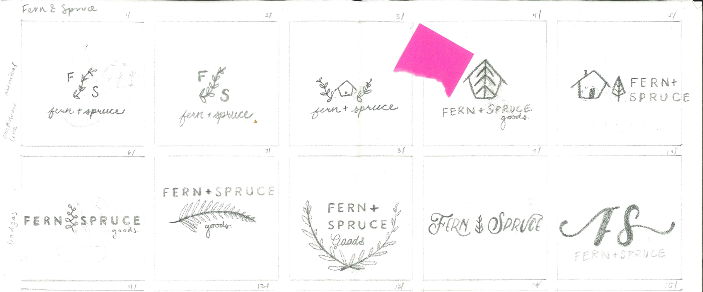
identity exploration
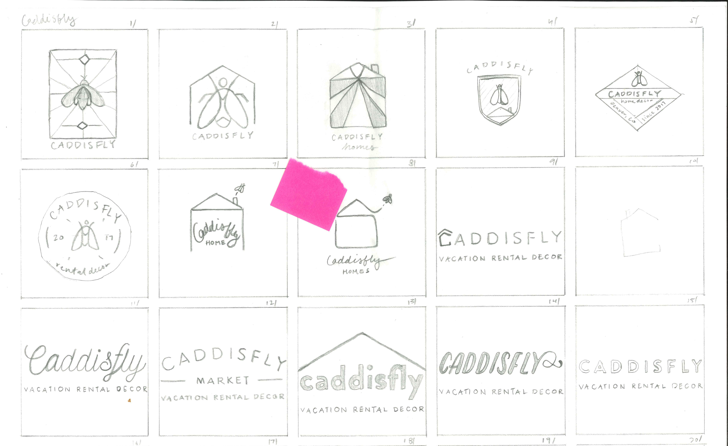
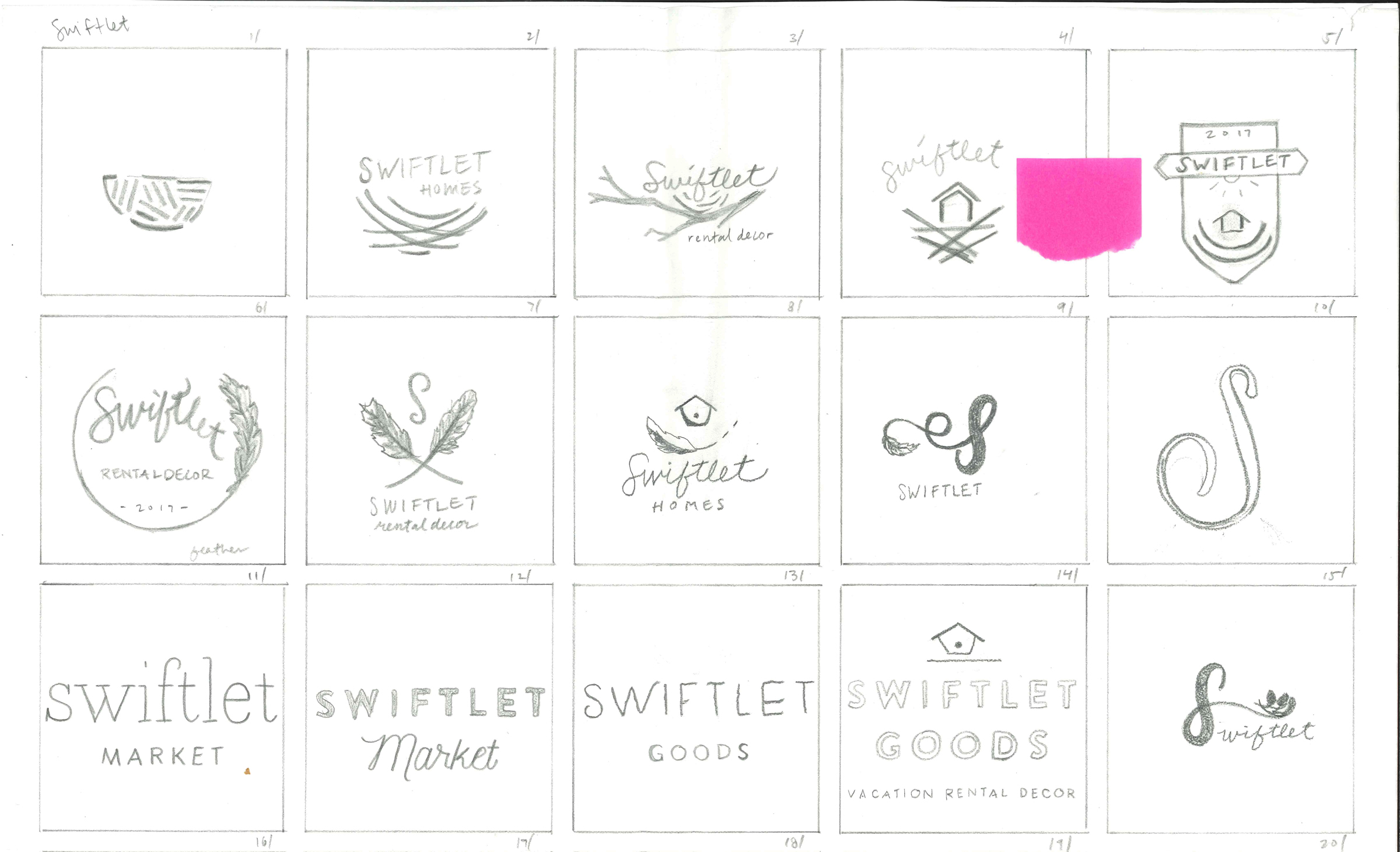
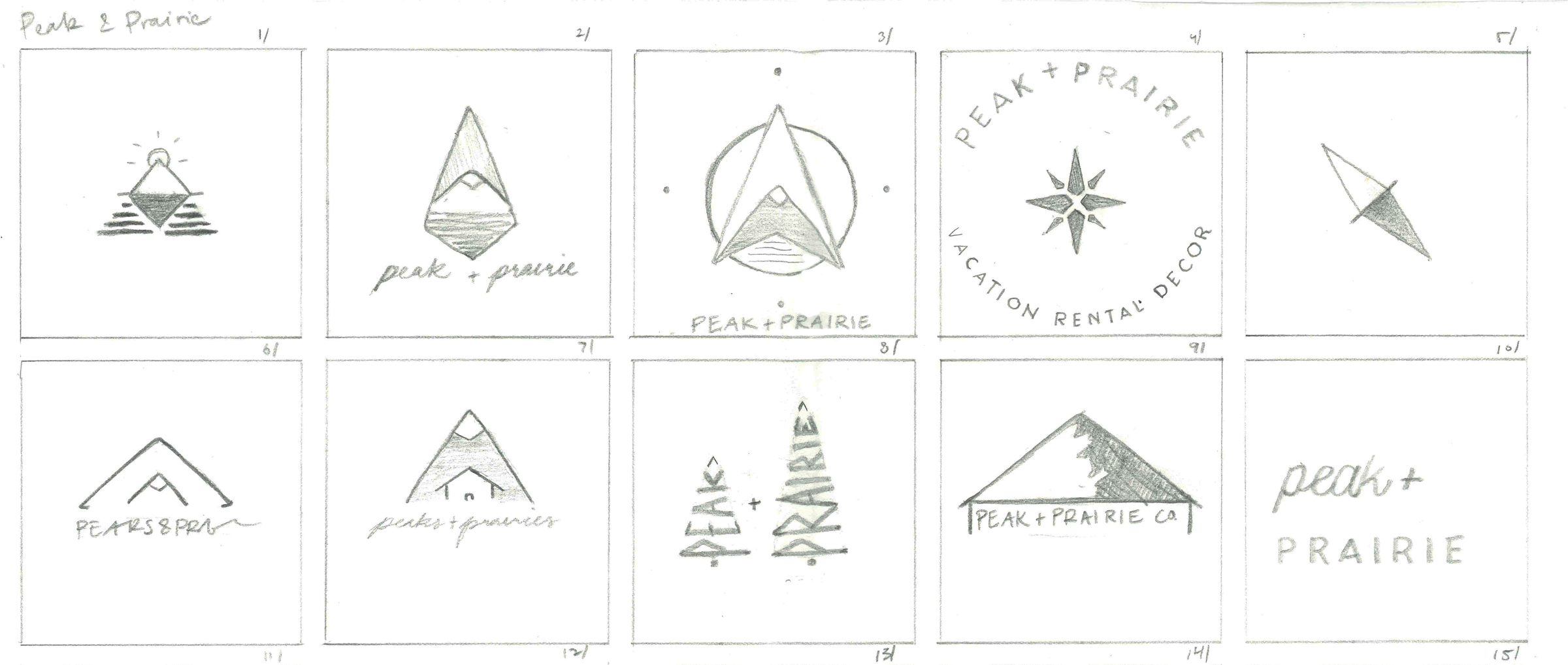
name + naming strategy
“Modern is a mindset. A mixture of materials, hard and soft.”
Brand Voice
The Fern + Spruce brand voice is familiar, warm and personable, while remaining professional, informed, and authoritative. It is feminine without being girl-ish. It is never condescending, pushy, or a know-it-all. All written content is conversational and represents an open exchange of ideas between Fern + Spruce and the customer. Customers aren’t here to be sold to, they’re here to be worked with. The tagline for F+S is simple and direct, outlining the brand’s USP in four words:
Patterns
Two patterns—one evoking tree rings and the other imitating woven textiles—will visually engage the viewers sense of touch before they are able to handle the products directly. To maintain the brand's softness, textures will be applied at 50% opacity.
Photo Style
The photo style of Fern + Spruce is best described as livable but not lived in, with personal items and live plants kept to a bare minimum or not included at all. Photos should be of rustic but modern spaces with a focus on decor products rather than the architecture or furniture. Stylistically, straight views or symmetrical shots work best.
Social Media Strategy
To engage with followers as a friend and mentor offering tips, testimonials, and style inspiration, we’ve developed a system of hashtags and inspiration-themed days.
#MondayInspo
#MondayMorning
#TransformationTuesday
#TestimonialTuesday
#TipTuesday
#WildWednesday
#WorkshopWednesday
#WednesdayWisdom
#ThankfulThursday
#ThrowbackThursday
#FeelGoodFriday
#FilmFriday
#FridayNight
Web Look + Feel | Shopify Template
As a startup, Shopify provides an affordable e-commerce platform to sell goods with unique and customizable templates.
Packaging Strategy
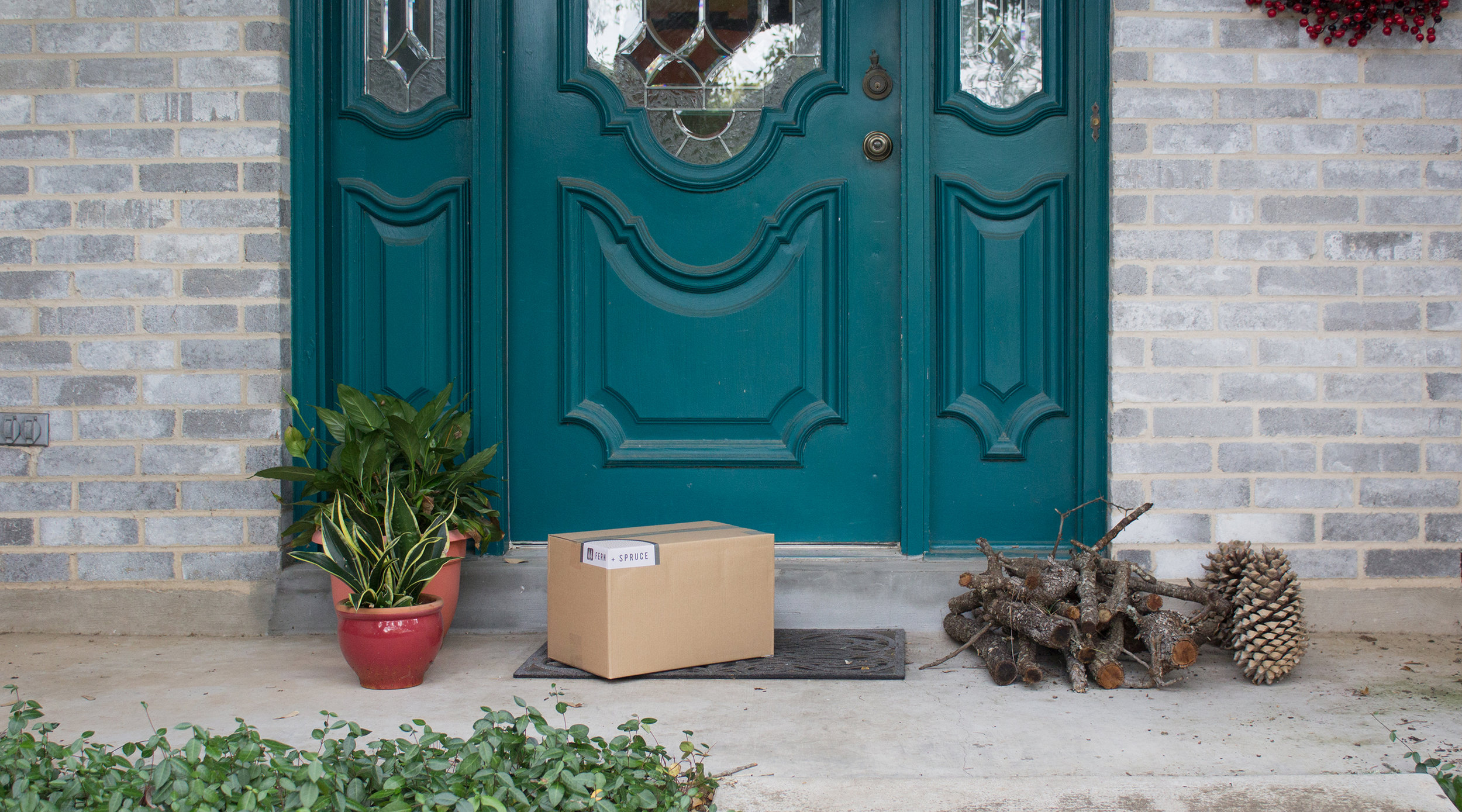
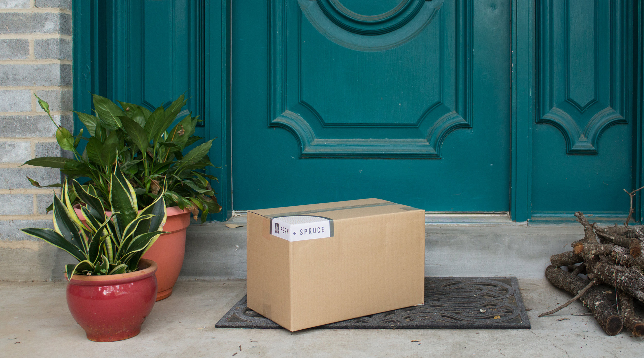
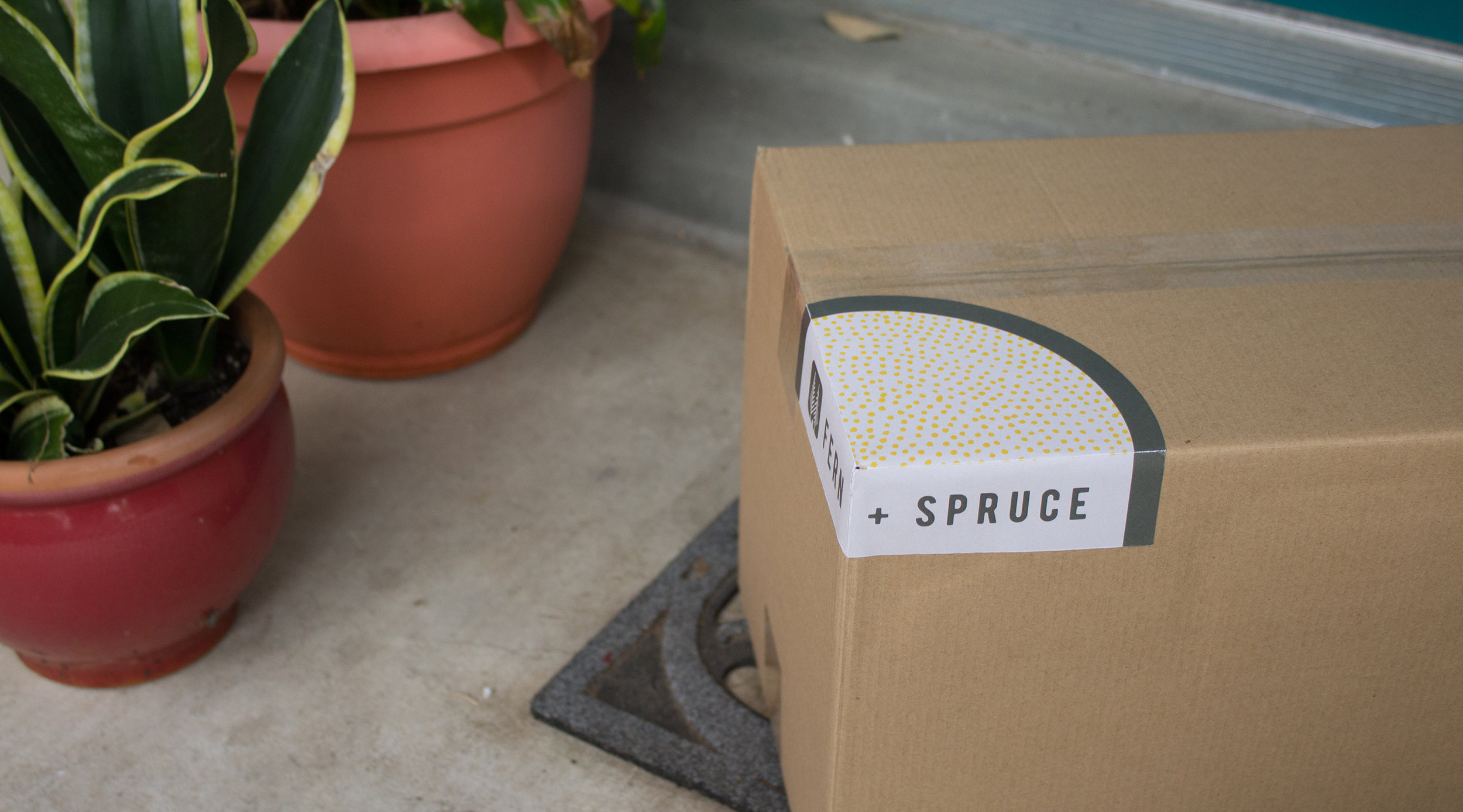
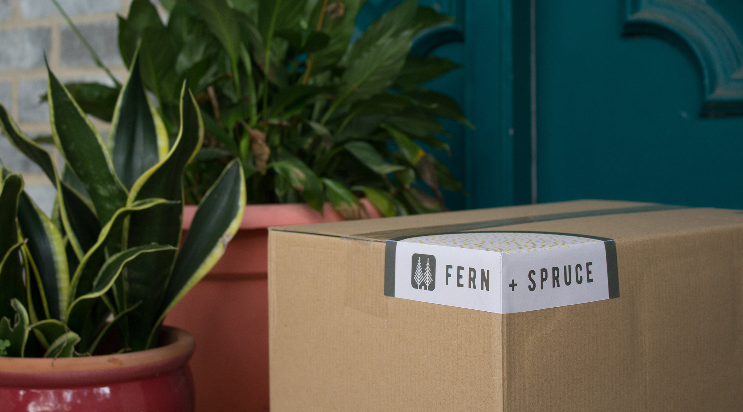
Packaging for Fern + Spruce will commence in two stages. At startup, products will be shipped directly from the manufacturer to the consumer—giving Fern + Spruce less control over the packaging experience. For the initial phase, Fern + Spruce will send branded corner stickers and thank you cards to manufacturers in bulk. The sticker differentiates the box, and the thank-you card doubles as a handy checklist so rental owners remember to stock the essentials. This ensures that customers will still get a taste of the brand experience from order to delivery. Once Fern + Spruce grows enough to gain full control over shipment, the brand can launch a fully branded packaging experience, including branded packing tape, tissue paper, and the continuation of the thank-you cards. All of these new elements will be included with a simple box in the brand’s Smoky Mountain Slate color.
advertising strategy
"Spruce up your space for better bookings.
With a campaign line that encourages strong brand recall, Fern + Spruce reminds customers that when they spruce up their rental spaces they book better, garner more reviews, and ultimately earn more money. Customers are targeted using SEO, social media, web & mobile ads, and thoughtful event collateral to meet them at their most convenient point of purchase.
Native advertising
email newsletter
The bi-monthly email newsletters serve to point consumers to the blog & website, and offer coupons, sales, and shipping discounts as purchase incentives.
podcast ad
One goal of Fern + Spruce is to meet customers where they live. This includes advertising with podcasts such as Style Matters, The Property Management Mastermind Show, and Young House Love to reach customers with a friendly voice while they are comfortable and receptive to new information. This ad was read by Sherry, from the podcast Young House Love.
"You want better bookings, your guests want an unforgettable experience. With unique well crafted pieces from Fern and Spruce, you can elevate your listing and create a vacation space that's stylish and comfortable. Shop a curated assembly of rustic modern decor at fernandspruce.com. That's Fern and Spruce dot com."
conference leave-behind
A square 3" card attached to a free USB drive makes for a conveniently carried leave-behind, containing editable, printable documents and a discount on the user's first purchase. Documents include templates for: important phone numbers, local restaurants, how-to instructions for around the house, and other important information that property managers need to make available to their guests.
Thank you for scrolling! (Back to Top)
